top of page
CampusNav
The ultimate app to help you navigate your college campus

Summary
CampusNav is a mapping app designed specifically for students at universities, as universities have a special set of challenges for navigation. Over my years in college, I noticed how many people (myself included) complained about not being able to find classrooms, certain building entrances, or about buildings that just felt impossible to navigate overall, no matter how many times we'd been inside. I wondered if there was a way to remedy this problem, especially because time is such a valuable resource, and we'd all rather sleep in 10 extra minutes over scrambling through liminal hallways.
Role
UX Designer, Graphic Designer
Timeline
10 Weeks
Team
Janna Jacobson, Clara Christopherson
Discovery
Preliminary Research Survey
Finding navigation issues on University of Michigan campus
We are using U of M as a case study for pain points students encounter when trying to find or travel to locations on campus. We sent a survey at random out to the student population and received 50 responses with an almost even split between freshmen, sophomores, juniors, and seniors.
Q: How easy or difficult is it for you to navigate U of M campus?
Q: What are some problems you face when navigating U of M campus?
Q: What methods of navigation do you currently use?
Not Difficult: 66%
Somewhat Difficult: 24%
Very Difficult: 6%
Neutral: 4%
Finding rooms in buildings: 30%
Bus systems: 26%
Building name abbreviation: 23%
Finding parking: 10%
Other: 6%
App: 36%
Asking directions: 33%
Physical map: 26%
Other: 5%
Problem Statement
With bus routes running late, coffee lines too long, and the names of university buildings being abbreviated in the most inconvenient lettering, students already have trouble finding their way around college campuses. And once they finally reach their destination, they're now faced with a maze of hallways, corridors, and rooms, adding more time and stress to their journey. While typical navigation apps offer help with getting to the building, they don’t include maps or directions to navigate within them, which proves difficult when they're trying to find a single room in a maze of hundreds of others. Students need a way to find their assigned building, AND classroom free of confidently, stress free, and efficiently.
Key Research
Finding navigation issues in the MATH (Mason, Angel, Tisch, Haven Hall) building
With our given resources and time, we again narrowed down our research to one of the most used buildings on U of M campus. The MATH building holds classes for students from all majors and years, so our sample was very diverse, and included many types of students.
Method 1: Survey
To lead our future methods of investigation, we began by sending a survey to a randomized set of students who attend U of M about how they feel when navigating the MATH building. We received 27 responses with an almost even split between freshmen, sophomores, juniors, and seniors. The results guided our other two methods.
Q: What challenges do you face when navigating MATH?
Q: What wayfinding system features would you most like in an app for navigating campus?
Q: How difficult is it to navigate MATH?
Not only did the survey confirm how difficult it was for students of all years and majors to navigate the mATH building, but it highlighted certain aspects that made it hard, such as building layout and finding rooms.
Building layout: 47%
Finding specific rooms: 35%
No challenges: 12%
Other: 6%
Somewhat difficult: 41%
Very difficult: 41%
Neutral: 12%
Very easy: 6%
Interactive maps: 35%
Step-by-step navigation: 23%
Search function: 18%
Real-time location: 18%
Accessibility information: 6%
Method 2: Observation & Interview
To see firsthand how students navigate the MATH building, as well as to identify pain points in navigation, we selected room 1150 for students to find, and a specific (most commonly used) entrance for students to navigate from. After they found the room, we interviewed them on their experience. The average time it took was 7 minutes.
Notable answers:
Q: “How did you feel when trying to find Room 1150?”
A: “I felt stressed out and confused while trying to find the room I needed.”
A: “Frustrated.”
A: “[I was] overwhelmed, mainly when I trying to find out which building was which and where the room numbers were.”
A: “It was okay, [because I’m more familiar with Mason Hall], but once I was in Angel Hall, I was confused. I feel like freshman wouldn’t be able to find it.”
Common Pain Points:
Inconsistent signs, numbers, floors, etc. between building sections
2
Lack of maps with room numbers
3
The observation and interview reiterated how difficult it is for students to navigate the MATH building, and gave us more specific information on their emotional state and frustrations with the building, as well as ideas on features they wanted in an app.
Layout is too confusing
1
Method 3: Card Sorting
Because most students identified navigation apps as their main method of finding buildings, we used card sorting to visualize their mental models on what features their way finding methods entail, and what features our solution should have. We chose various features that already exist on apps, as well as features we might include in apps. We also added building features and some items related to general navigation. Additionally, we included a section where participants stated why they sorted the cards in specific groups.
Participant 1
Participant 2
Participant 3
Our main findings were that individuals sorted based on groups of physical and digital maps, or features based on ease of use. Thus, we were able to see what students might expect or find simplest to use from a navigation app.
20% on-campus, 80% off-campus
Synthesis
Persona
Bio
Kali is a busy sophomore at U of M. She takes some classes in the MATH building, but is still unfamiliar with traveling between each section, which she will need to do for her current semester. She is frustrated by the fact that every new semester, she takes too long to find her classes within MATH, especially with her busy schedule
Age:
Gender:
Education:
Location:
Archetype:
19
Female
U of M
Off Campus
Student
Practical
Social
Hardworking
Timely
Needs
Pain Points
To spend less time finding class
To ease anxiety when finding class
To easily navigate weird campus buildings
To spend less time finding class
To ease anxiety when finding class
To easily navigate weird campus buildings
Technology
Internet
Mobile Apps
Software
Early Adopter

Kali Vallagrana
"I'm looking for an easy way to find rooms in the MATH building."
Personality
Extroversion
Introversion
Sensing
Intution
Thinking
Feeling
Judging
Perceiving
Motivations
Time
Convenience
Speed
Comfort
Efficiency
Design Goals
Must be accessible and easy to use, given the diversity of a student body.
1
Must be easy to learn and comply with already existing mental models for mapping apps
2
Must give users a mapping experience tailored to university
3
Ideation
Crazy 8s
With an 8 minute timer, my partner and I quickly sketched some concepts to get our ideas and creativity flowing.
It became clear from our crazy 8 session that several key features were needed, including two versions of the map (one for students to click and scroll through on their own, and one with directions), and the ability to upload classes, a profile page to find said classes, and a search function.
User Flow Map
To streamline our features it was important to make a map of core app functions
Find Classroom in MATH
Search Location
Browse Maps
Import Schedule
Search Room #
Search Professor/Class
Save Classroom
Save Info
Map Directions
Go
Choose Hall
Choose Floor
Zoom Function
Select Room
Go
Select Class
Set Class Reminders
Map Directions
Go
Navigation Sketches
After determining key functions of the app, we sketched several versions of the navigation bar
The main similarity from our sketches included a bottom navigation bar, so we moved forward with that format for our mid-fidelity prototype.
Mid-Fidelity Prototype & Testing
Testing
We randomly selected 5 participants within our target demographic to complete specific tasks through the prototype, then answer questions about their experience using the app.
Tasks
1
Import all classes
2
Find the MATH map from the Home page
3
Search for room 1150 in Angel Hall
Conclusions from Observation & Question Answers
1
2
Bottom nav bar confused users; they felt we just needed profile and search.
Users felt uploading from both Wolverine Access and Atlas was redundant.
WCAG Compliance Checklist
We also highlighted some key accessibility points we wanted to accommodate, some of which are listed below.
1
Color contrast: 3:1 for bold/large text, 4.5:1 for small text
2
Text can be resized to 200% with layout
3
Appropriate touch target size: min 44pt
4
Consistent Function
5
Clear Structure
After running our app through the Figma Stark plug-in, we found that our color contrast was slightly too low. The original green we chose was lighter, so the white text did not read well for those with visual impairments. However, our touch size targets are more than large enough, our structure throughout is consistent, and all our buttons have consistent functions on every page, making the app easy to follow.

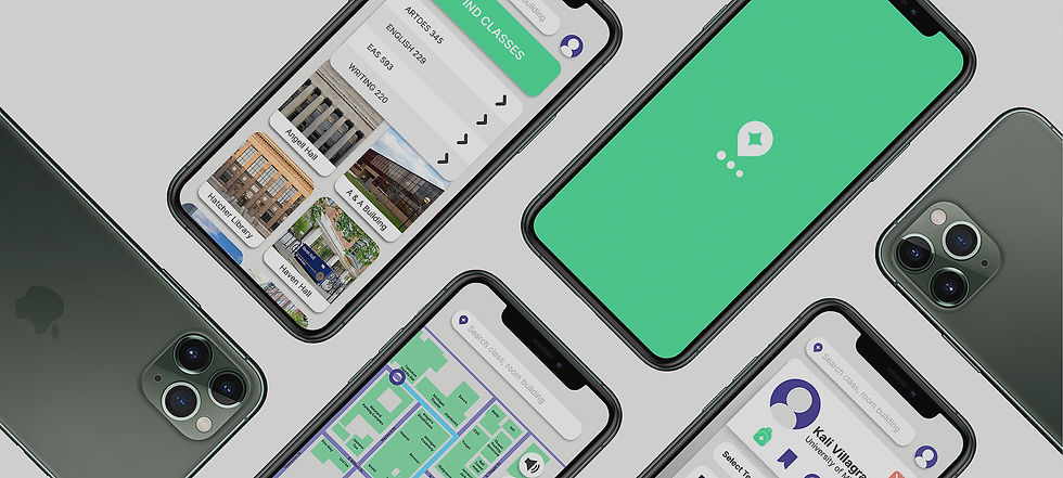
Final Prototype
Our Features
All these features are catered to students and their needs, making the trip to class from home to room seamless and intuitive.
In-building navigation
Uploading classes from schedule
Interactive building maps with room numbers
Find classes button
Saving locations
WCAG compliance


Sign In

Recently Visited

Home

Find Classes

Class Upload

Building Map

Downloaded Classes

Start Journey
Design Guidelines
Color Palette
Neutrals
V1
V2
V3
Accents
Primary
Secondary
Tertiary

#4FE49E
109,230,173
53,0,25,10
#4A4299
74,66,153
52,57,0,40
#F8897A
248,137,122
0,45,51,3
#373737
55,55,55
0,0,0,78
#EBEBE9
235,235,233
0,0,1,8
#FFFFFF
255,255,255
0,0,0,0

Typeface

What We Learned
Sometimes less is more. Our mid-fidelity prototype included both a bottom menu and a profile button in the top corner. And when combined with some of our other features, users found the navigation confusing. During testing we found participants wanting a simpler layout. Because our app was catered to students and included more features than a typical mapping app, my partner and I made the mistake of thinking the more specific our design was, the better. But we learned to have faith in our users and in their preexisting mental models of navigation apps, and simplified the flow by removing the bottom navigation bar.
If I were to continue developing CampusNav, I'd definitely add other features, like alerts for construction and alternative routes based on coffee or food spots. A common need for university students is grabbing a quick drink or snack between classes, and seeing wait times or shops between two buildings would be especially helpful.
bottom of page